
Eye Chart With Hidden Message
A wedding gift for my brother. I wanted to make something that didn’t rely on electronics, but was still an original idea. So I made an eye chart that folded into a secret message.
Brainstorming
Since my brother is an eye doctor, I immediately thought about different sorts of optical illusions. I wanted to make something that would contain a “secret” message. Some mechanisms I considered were:

Shadow Sculptures
Hidden QR code
In the end, I decided to go with the iconic Snellen Eye Chart.

Designing the Chart
While I could simply make the letters in the chart contain a message, I had the idea that the chart could be a Triptych (a three-panel artwork) showing the message when the sides fold shut. I’d do this by having the letters be cut through the design and have the letters seem random when seen from the front, and make the message when they flip over. My familiarity with laser cutter design is why I decided to go with this.
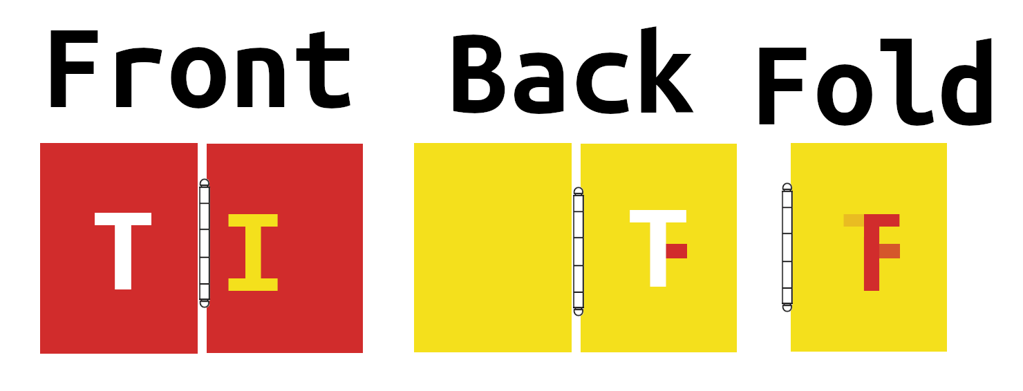
This meant that I had to design the letters so that they would spell the message when flipped horizontally. I used a few different techniques to get the letters I wanted when the Triptych was folded shut. I could use letters with vertical line symmetry directly (H, I, O, etc.). Some letters looked a little like others when flipped (Z→S, q→p). But for other letters, I needed a way to add and subtract lines. To do this, I made the front and back use two different colors. That way I could draw the lines to add on the back, and overlap with the lines I wanted to remove. See below:
I considered a few different quotes and messages to put into the chart, mostly from movies or songs the couple shared. I ended up choosing one partly because the letters were relatively easy to flip.
What do you expect? To live happily ever after? Yes.
The Parent Trap 1998
Now that I had my work cut out for me, I wanted to automate the design layout as much as possible. I considered adding scripting to Inkscape, but decided the easiest approach would be to use the SVG manipulation library https://github.com/cduck/drawsvg and make a Python Jupyter notebook.
You can see what I ended up with here: https://github.com/axlan/word_triptych/blob/master/draw.ipynb
Originally, I planned to fill the entire chart with letters and control the overlapping by subtly offsetting the letters. Once I started experimenting, I decided to make my life easier by doing a layout with large gaps, and drawing an image through the center that would create the desired overlaps.
Another decision I made to simplify things was to use a monospaced font. This made calculating the spacing a lot easier. Another requirement for the font was that the letters could be cut out. For letters with internal shapes (like A, B, P, etc.) the font would need bridges to look right. Initially, I considered a bunch of stencil fonts. However, these tended not to be as clear at the various sizes. In the end, I started with “Ubuntu Mono” and edited it with a program called FontForge. I followed this tutorial https://www.youtube.com/watch?v=ch8KuiABczo. While the changes I wanted were pretty basic, I found the process a bit finicky. I also found that Inkscape was very inconsistent about reloading the font after I made changes and reinstalled it https://gitlab.com/inkscape/inbox/-/issues/12513.
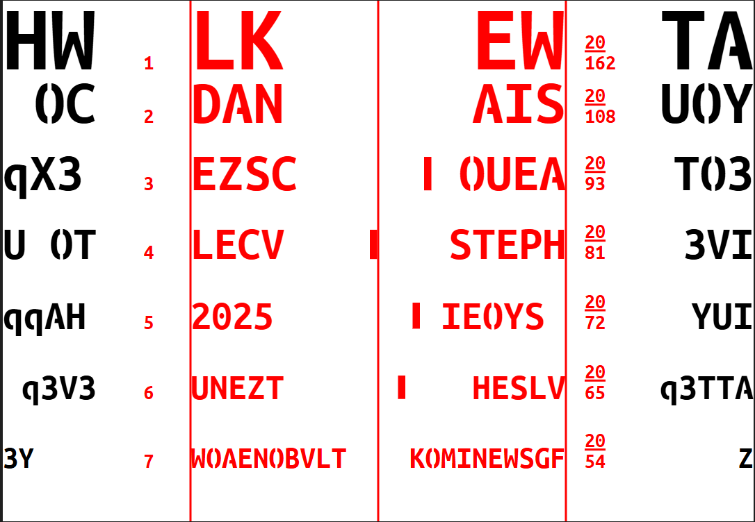
Since it’s an eye chart, I wanted to include the vision acuity values for each row. I started from these eye chart values and came up with values between 20/162 and 20/54 when I measured the sizes the letters scaled to on the final design.
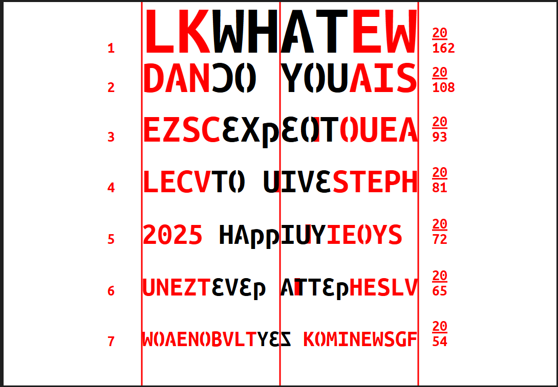
After a few iterations of arranging the letters, I ended up with the following “simulation”. When making a design for a laser cutter, each color represents a different sort of cut. I used black for things that should be cut out, and red for lines that should be engraved.
Cut SVG:
Fold Simulation:
While trying to export the SVG for this write-up I hit a weird SVG issue. I originally wanted to post the actual SVGs, but to have it look right it would need to have my custom font available. I tried to host the file on this blog and have the SVG import it, but I hit a series of issues. First, viewing it locally was giving CORS errors. When I fixed that, the SVG would look OK when viewed on its own, but when it was embedded on this blog page, the custom font didn’t work. Rather than continuing to fight this, I’m just using raster images.
From these generated files, I still needed to do some manual steps. I used Inkscape to draw a flower over the regions that would need overlaps. To avoid any potential issues with the font, I also converted the text to shapes.
Building the Chart
While I have a laser cutter, this would be a bit too large for my device. Initially, I wanted to use a local maker space, but after doing some research I found a local shop that could cut all sorts of materials for less than the monthly membership. I ended up going with 1/8in MDF which cost $60. Initially, I was worried that the MDF might swell at the edges when I painted it, but it turned out fine in the end.
After a couple days, I got the cut back:


It was only at this point that I planned out the rest of the steps to paint and finish the design. I got some primer (Kilz original), some house paint samples, and a clear coat for the finish. I also got some hooks for hanging, and some small hinges. I painted the background coats with a small paint roller, but realized that it was going to be a pretty tedious process to paint the engraved letters and the flower in the middle. In retrospect, I should have done a raster engrave for these shapes instead of the vector outline engraving. Painting by hand would have been easier, and I could have even tried a powder coat paint https://www.youtube.com/watch?v=5slQcAI2WSw. I ended up needing to do three or more coats and even then it wasn’t particularly even.

As a flourish, I used gold leaf for the bride and groom names on the front. This turned out to be a bit of a pain since the leaf stuck a bit to the paint and didn’t come off cleanly. I managed to get a system of using a razor and painter’s tape to more cleanly lift off the excess.

For the portions being added to the flipped letters, I used painter’s tape to mask on the extra lines.

After some touch ups, I put on the clear coat and added the hinges.


In the end, while it came out pretty well, the “subtractive” part of the design isn’t as strong an effect as I would have liked. It works when looked at closely, but from further away, the shadow of the closed panel partly obscures the color matching.